Introduction & Context
This dashboard tracks near real-time coal generation in Victoria using Dispatch_SCADA telemetry from the AEMO. It visualises output from registered coal-fired units across the region, highlighting daily trends, unit-level performance, and capacity utilisation. The goal is to surface short-term dispatch behaviour and support visual storytelling around legacy thermal generation assets.
Problem / Observation Goal
Coal generation remains a major contributor to Victoria (Brown Coal), New South Wales (Black Coal), and Queensland (Black Coal), but its dispatch profile varies by unit, time of day, and market conditions. This dashboard filters SCADA data by fuel_descriptor = 'Brown Coal' and region = 'VIC1', presenting both total output and per-unit traces. A clear pattern emerges: as solar generation tapers off in the late afternoon, coal units ramp up to maintain supply — effectively handing over grid support from renewables to thermal. This dynamic swap is visible in the stacked traces and supports operational.
Data Sources & Collection
- Source: AEMO Dispatch_SCADA dataset via NEMWeb
- ETL: Python script (
GetStore_Dispatch_SCADA.py) running on Raspberry Pi 5 - Database: PostgreSQL storing timestamped SCADA records with DUID mapping
- Visualisation: Grafana dashboards with per-unit gauges and stacked output traces
- Hardware: Raspberry Pi 5 acting as orchestration node and edge server
Design Philosophy & Dashboard Approach
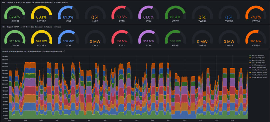
The dashboard is designed for clarity and dispatch visibility. Each coal unit is represented with a circular gauge showing current output (MW) and percentage of nominal capacity based on participant registration data. A stacked area chart shows total coal output over time, with each band representing a unit’s contribution. This layout supports anomaly detection and generation unit comparison.
System Architecture
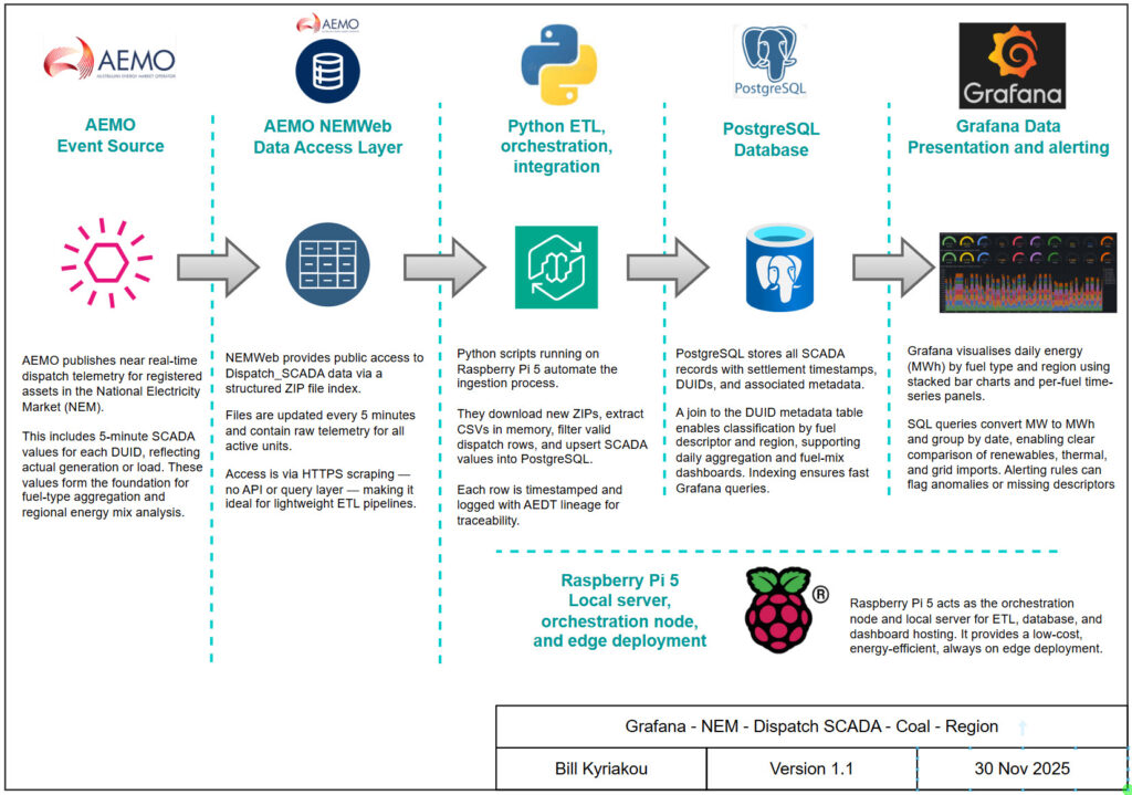
Data flow: NEMWeb → Python ETL → PostgreSQL → Grafana
- Python script connects to NEMWeb Dispatch_SCADA index and downloads new ZIP files
- CSV files are parsed in memory, filtering rows starting with ‘D’
- SCADA values are upserted into PostgreSQL with structured logging and AEDT timestamps
- Grafana queries filter by region (VIC1) and fuel descriptor (Brown Coal), aggregating per-unit output.

Dashboard Showcase
- Top panel: Circular gauges showing real-time MW output and % capacity for each coal unit (e.g. L01Y01 to L01Y11)
- Bottom panel: Stacked area chart showing total coal output over time, segmented by unit
- Legend: Each unit trace is colour-coded for clarity and comparison
- SQL filters: Region = ‘VIC1’, Fuel Descriptor = ‘Brown Coal’

Outcomes & Insights
- Dispatch visibility: Real-time and historical coal output is now trackable per unit
- Unit comparison: Gauges highlight which units are active, idle, or partially loaded
- Operational reliability: Raspberry Pi 5 and PostgreSQL ingest and serve data continuously
- SCADA transformation: Instantaneous MW values are visualised directly and grouped by unit
Lessons Learned
- Generator unit-level filtering improves clarity over fuel descriptor aggregation
- Gauge panels benefit from consistent naming and capacity metadata
- Stacked charts reveal dispatch patterns and ramping behaviour across units
- Modular ingestion pipelines scale — same structure reused for solar, wind, and battery dashboards
Future Development & Fixes
- Add nominal capacity metadata to enable dynamic % calculations
- Integrate market price overlays to correlate coal dispatch with price signals
- Expand dashboard to include NSW and QLD coal units
- Refactor SQL for dynamic fuel descriptor selection and longer time windows
- Grafana x-axis formatting: Cast settlement_date to timestamp and normalise to UTC for cleaner date/time labels
- Develop new coal dashboard to view long term trends of coal usage as solar and battery plants come online.