Introduction & Context
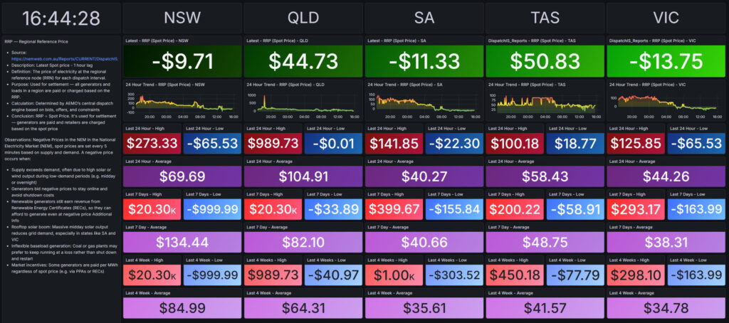
This dashboard visualises real-time electricity spot prices across the National Electricity Market (NEM), covering NSW, QLD, SA, TAS, and VIC. It provides a state-by-state breakdown of current prices, historical high, low and average prices. The goal is to present the price volatility across the day and how prices vary from regional to region.
In the NEM, the spot price is the price paid by retailers to generators for electricity delivered in real time. It’s calculated every five minutes by AEMO and reflects the immediate supply-demand balance in each region. When demand surges or supply tightens, the spot price spikes — prompting fast-response generators to ramp up. When supply exceeds demand, prices can fall sharply, even turning negative.
Spot prices vary by state and are a key signal for operational decisions, market interventions, and energy analytics. While consumers don’t pay the spot price directly, it influences retail pricing and contract strategies.
Problem / Observation Goal
Spot prices in the NEM fluctuate rapidly due to generation mix, demand surges, interconnector constraints, and market interventions. Raw data is available via the AEMO feeds, but lacks visual clarity and operational storytelling. This dashboard was built to track price spikes, negative pricing events, and generation-demand mismatches across states — helping identify anomalies and support energy market analysis.
Data Sources & Collection
- Source: AEMO near real-time spot price (RRP). (DispatchIS_Reports)
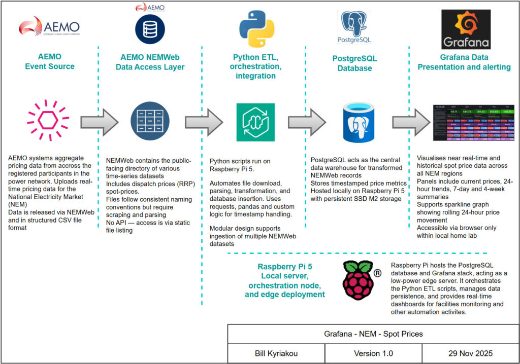
- ETL: Python scripts scheduled on Raspberry Pi 5
- Database: PostgreSQL storing timestamped price, generation, and demand records
- Visualisation: Grafana dashboards with state-level panels and trend overlays
- Hardware: Raspberry Pi 5 acting as edge node and orchestration server
Design Philosophy & Dashboard Approach
- The dashboard is designed for clarity and short-term trend visibility. Each state has its own column with:
- Real-time price display (green/red for positive/negative)
- 24-hour price trend graph
- 2-hour forecast commentary
- Last 7 days’ max, min, and average values for price, generation, and demand
System Architecture
Data flow: AEMO → Python ETL → PostgreSQL → Grafana
- Via the cron, the Python scripts connects AEMO NEMWeb endpoints and ETL’s the CSV data
- PostgreSQL stores time-series data with indexed timestamps
- Grafana queries the PostgreSQL database and renders dashboards based on the latest dataset
- The Raspberry Pi 5 hosts the entire stack, enabling low-power edge deployment

Dashboard Showcase

Outcomes & Insights
- Negative pricing detection: VIC, SA, and NSW frequently show sub-zero prices, often linked to solar oversupply or low demand
- Regional volatility: TAS and QLD exhibit more stable pricing, while VIC and SA show sharper swings
- Generation-demand mismatches: Historical data reveals periods of high generation with low demand, especially in SA and VIC
- Operational reliability: Raspberry Pi 5 and PostgreSQL setup ingests and serves data continuously without interruption
Lessons Learned
- Timestamp accuracy matters: Real-time dashboards require precise ingestion and indexing to avoid misleading trends
- Visual clarity drives insight: State-level columns and colour-coded panels outperform text-heavy layouts
- Modular architecture scales: The same ETL and dashboard structure can be reused for other AEMO datasets
- Edge deployment is viable: Raspberry Pi 5 handles ingestion, storage, and dashboarding with minimal overhead
Future Development & Fixes
- Add Prometheus exporters for real-time alerting on price spikes or significant negative pricing events
- Integrate weather overlays to correlate price volatility with solar/wind/fossil generation
- Expand to include interconnector flow data and FCAS pricing.